描述
A very simple widget that displays a single responsive, rationally proportional image in a widget area. Intended to make adding images (whose proportions are important) to sidebar areas easier for non-technical users who would have trouble using the text widget to insert images into the sidebar.
One of its key features is the fact that it allows proportional adjustment on the fly, so the user can easily change the proportion of the image inside of WordPress, instead of needing to resize the image in an editor (a problem for many users who do not have a lot of experience resizing/cropping images.) Basically, it creates a frame for an image rather than adding an image directly, and the frame size can be set before the image is added, much like in Adobe inDesign, where frames can be laid out and then have pictures inserted into them.
It takes a title, image URL, ratio and target link URL. It outputs a rationally proportional div with the image set as a background. Using the CSS background-size and background-position properties, the image always fills the whole space and remains centered.
Note: the image always fills the width of its container. If the widget/widget area where the image is placed is large, the image will appear large.
螢幕截圖
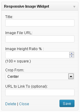
The widget controls. 
A vertical image frame. 
A square image frame. 
A very horizontal image frame.
安裝
- Upload
responsive_image_widget.phpto the/wp-content/plugins/directory - Activate the plugin through the ‘Plugins’ menu in WordPress
- Place widget(s) in your sidebar areas through ‘Appearance > Widgets’ in WordPress
常見問題
- The image is cropping badly. It is centered and I really wanted to see the top/bottom right/left corner. Can I change how the image crops?
-
Yes, you can control which edge the image crops from by selecting a side in the “Crop From” dropdown.
- Help! The image is gigantic and/or pixelated!
-
The image always fills 100% of the containing widget it is in. If the widget/widget area where the image is placed is large, the image will appear large. Use an image that is larger than the widget area you plan to use it in to avoid pixelation.
評價
貢獻者及開發者
修改日誌
1.1
- Added “Crop From” feature to help position image in frame.
1.2
- Added !important to CSS background property to prevent overwrite by theme styles.
1.3
- Added inline style for anchor element to display: block to make sure image displays.
1.4
- Fixed version update problem.